View.
Follow the arrow to essential
Dacia
Total Energies
Brand Strategy / Naming / Visual Identity / Design System / Brand Architecture / Tone of Voice / Sonic Identity (with Dissonnances) / Global Rollout / Digital / Signage
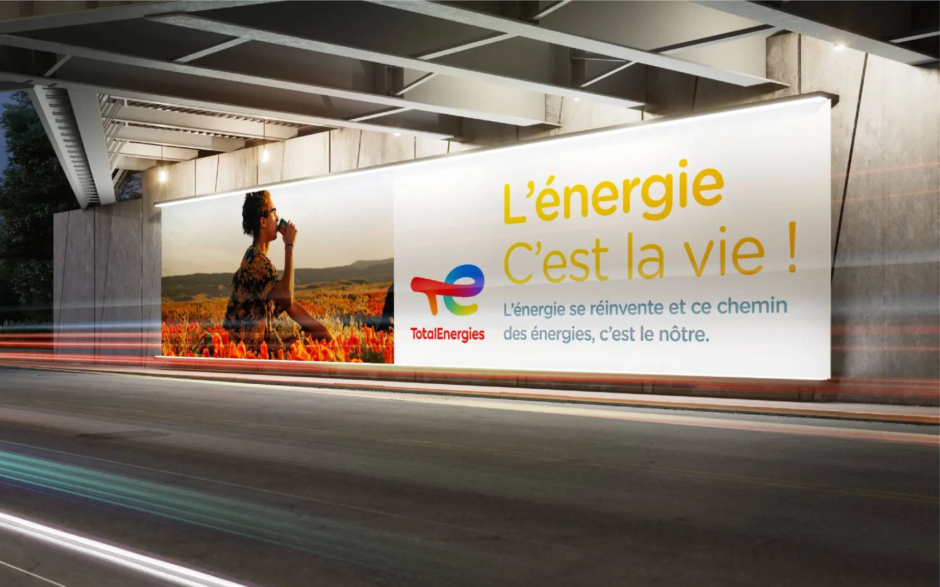
TotalEnergies, a brand that makes the transition resonate.
How can a company historically associated with fossil fuels become a credible player in the energy transition? For TotalEnergies, the challenge was not simply to talk about change, but to make it visible. Carré Noir supported this transformation by creating an identity built around a simple idea: “The Energy Path.”
A moving line becomes the symbol of the brand’s transformation. It connects different forms of energy, evolves over time and tells the story of a shift from a model dominated by a single energy source to a more diversified energy mix. From the historic red to solar yellow, through the blue of gas, the transition is not concealed — it is made visible.
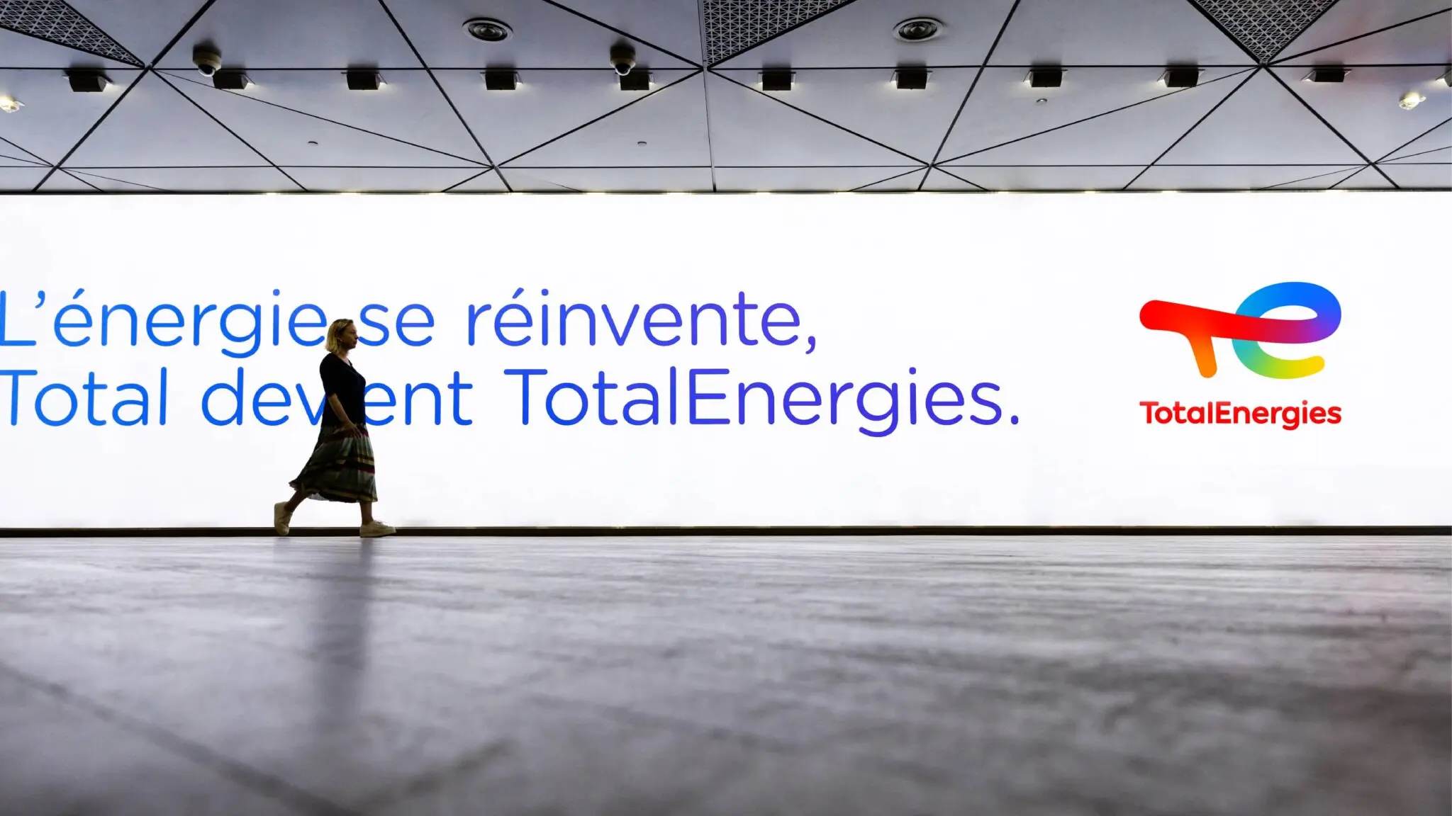
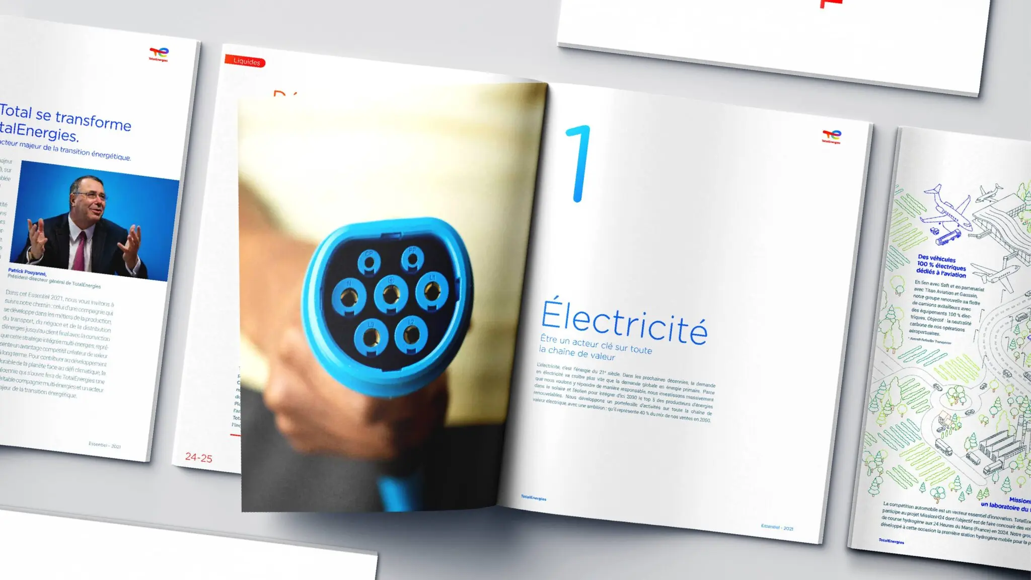
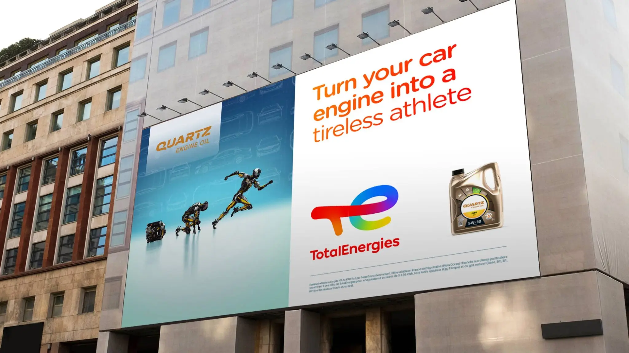
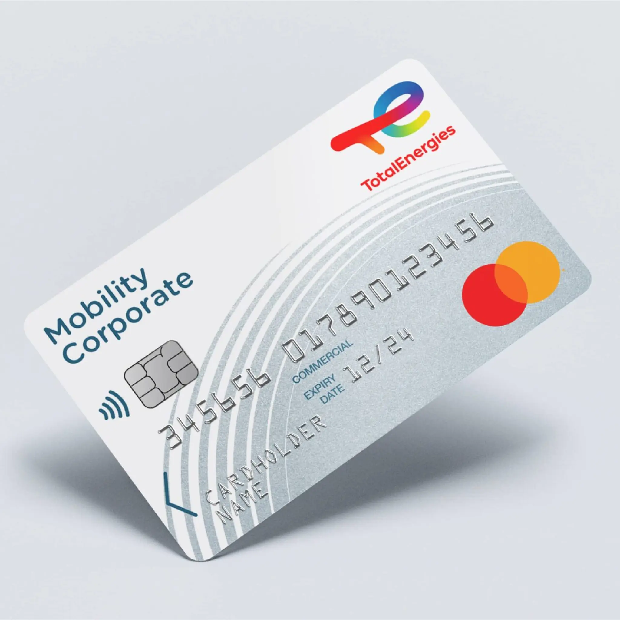
This vision is expressed throughout the identity. The shift from Total to TotalEnergies asserts this plurality, while the logo, typography and “T-E” monogram convey a brand in motion, looking towards the energy sources of tomorrow.
An identity designed to turn transformation into a tangible, understandable and credible story.