View.
Style and Impact
Iné
POPPINS
Brand Strategy / Naming / Visual Identity / Mascot Design / Brand Territory / Product Experience / Brand Rollout on the App / UI
Poppins makes sharing resonate as a new everyday norm.
We live in a quiet absurdity: the average French person owns 2.5 tonnes of objects, nearly a third of which are hardly ever used. A model centred on ownership that has become environmentally and socially unsustainable. The challenge was to create a brand capable of changing behaviours by making sharing feel as natural as buying.
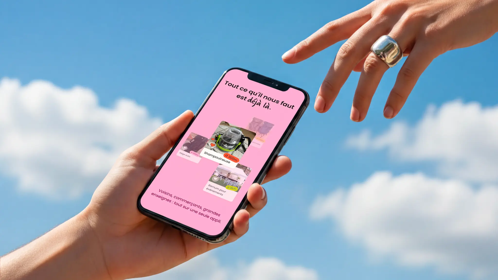
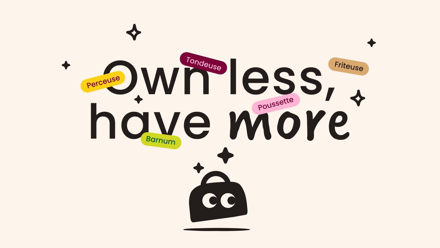
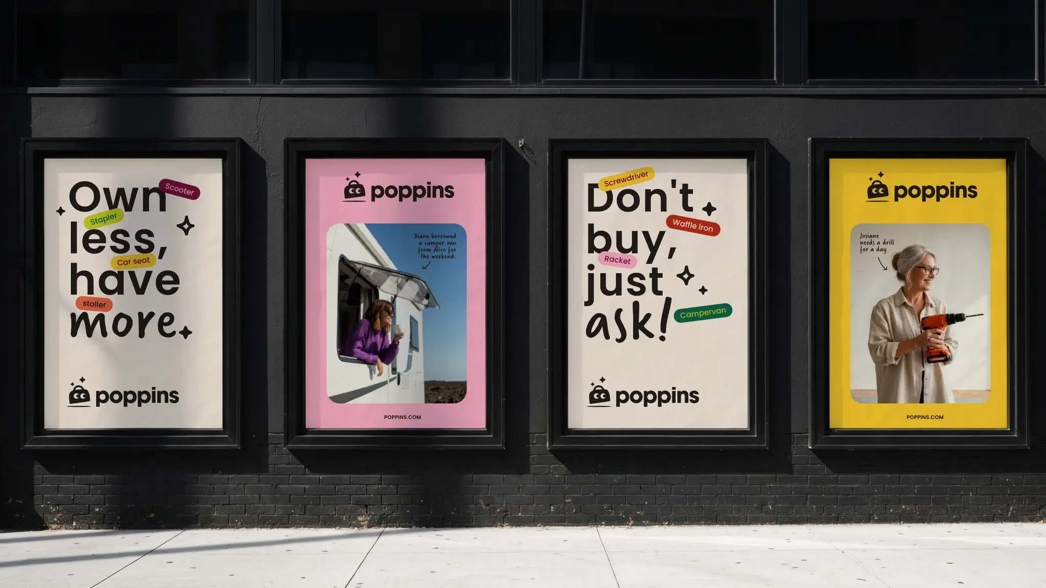
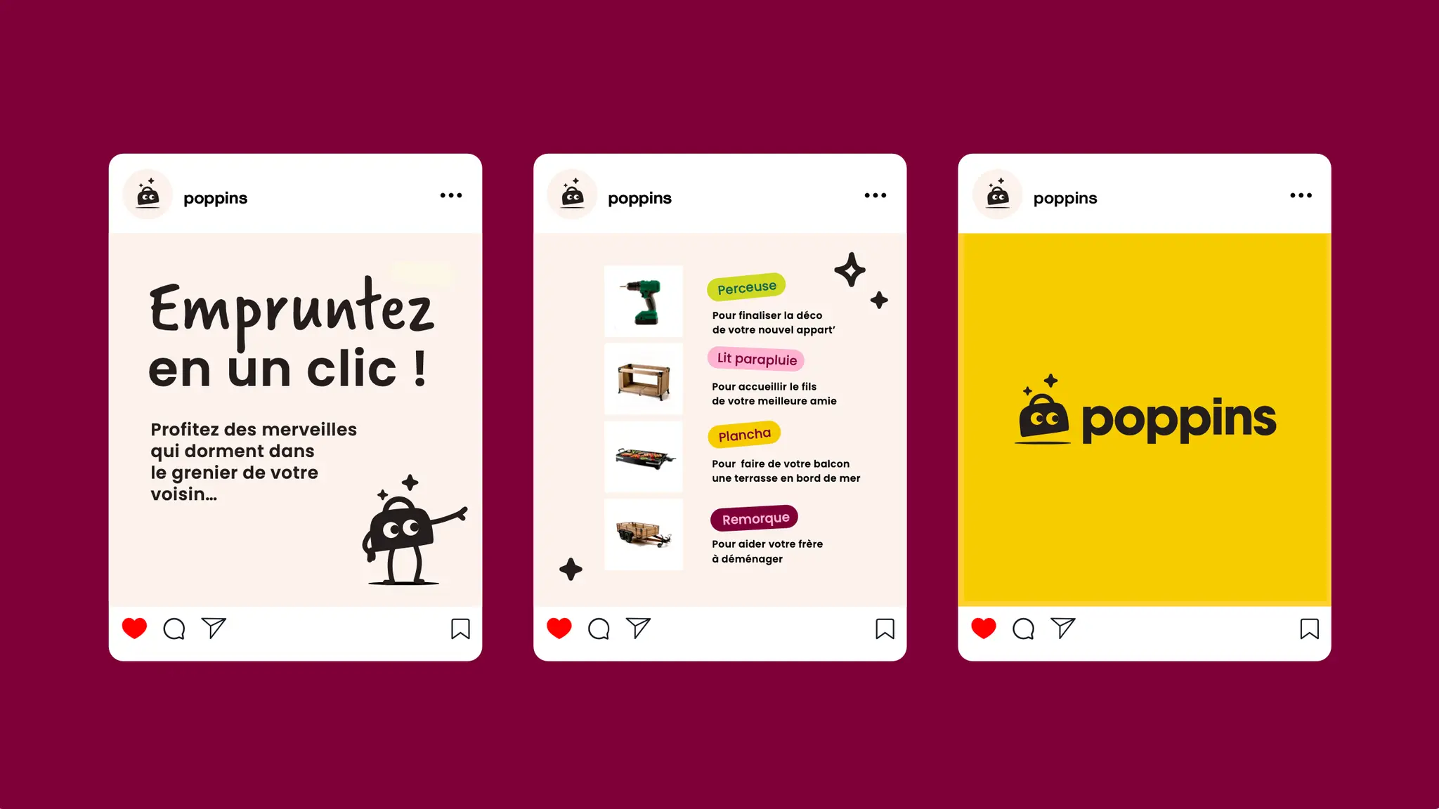
Created by Lucie Basch, Poppins brings neighbours and local businesses together on a single platform, enabling people to borrow and rent thousands of everyday items. To support this ambition, we developed the signature “Own Less. Enjoy More.”, turning a constraint into a positive promise.
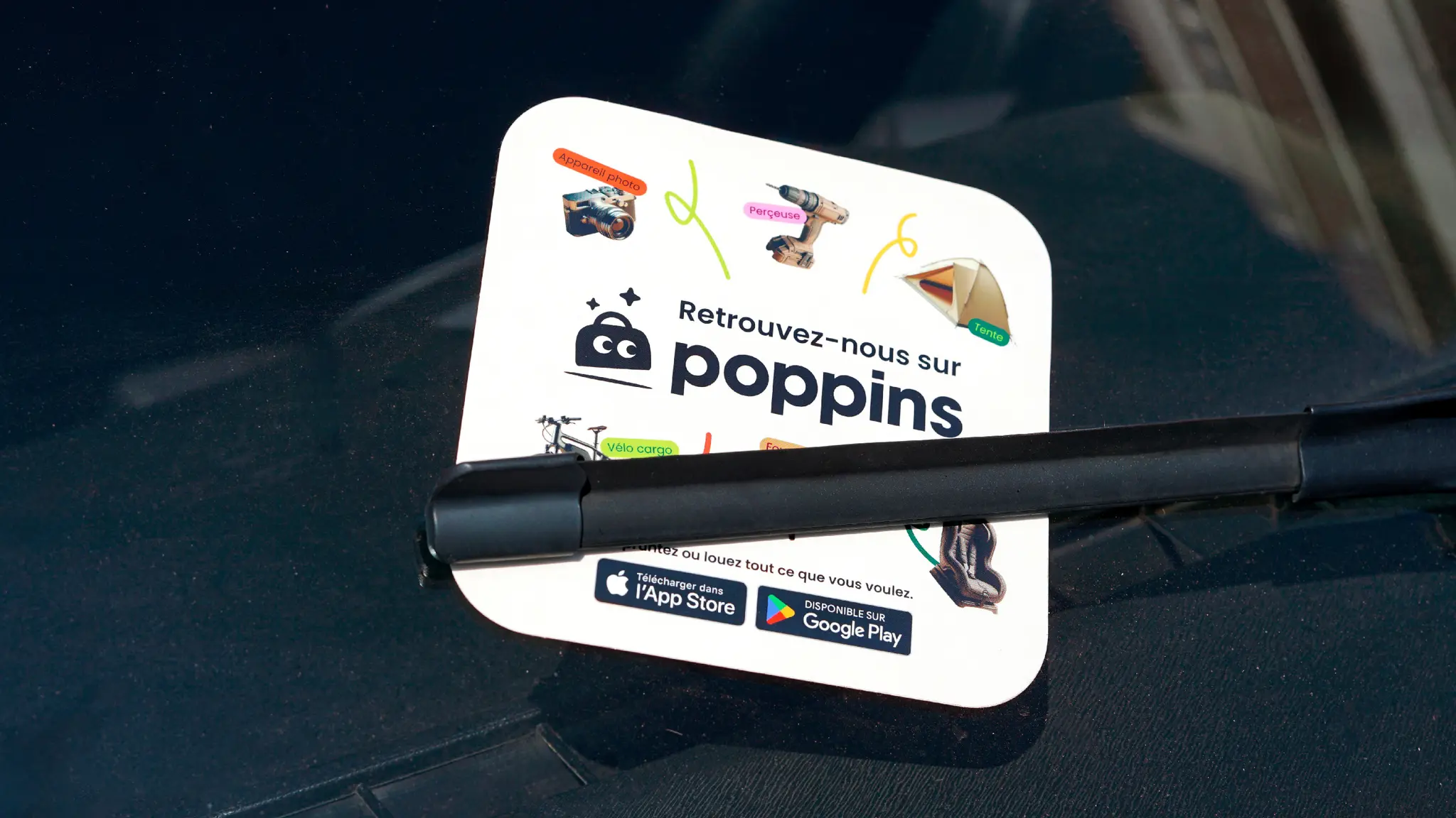
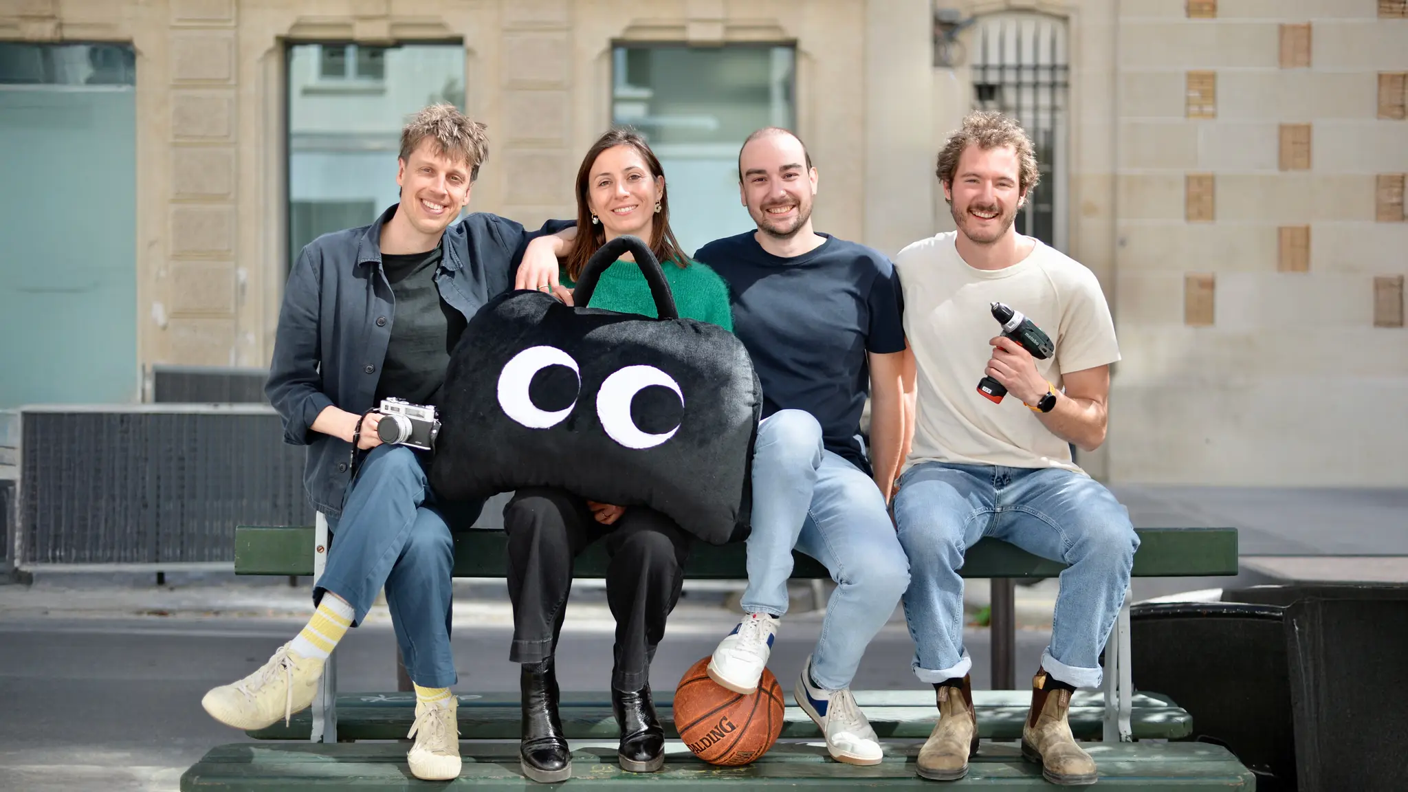
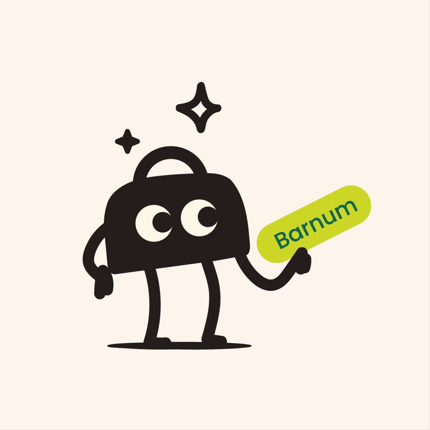
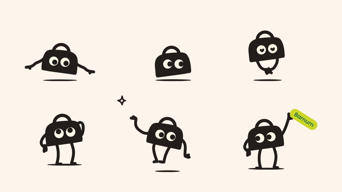
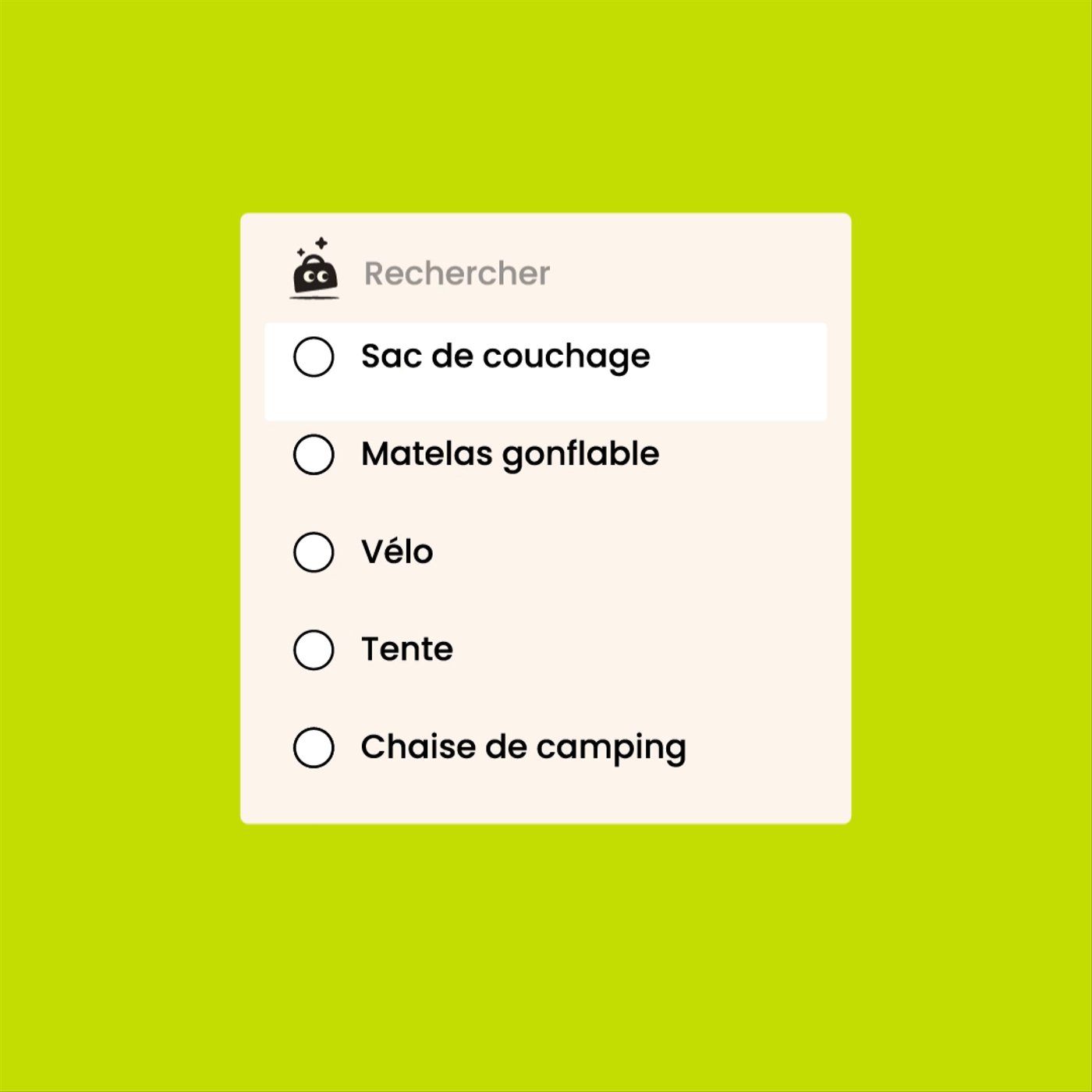
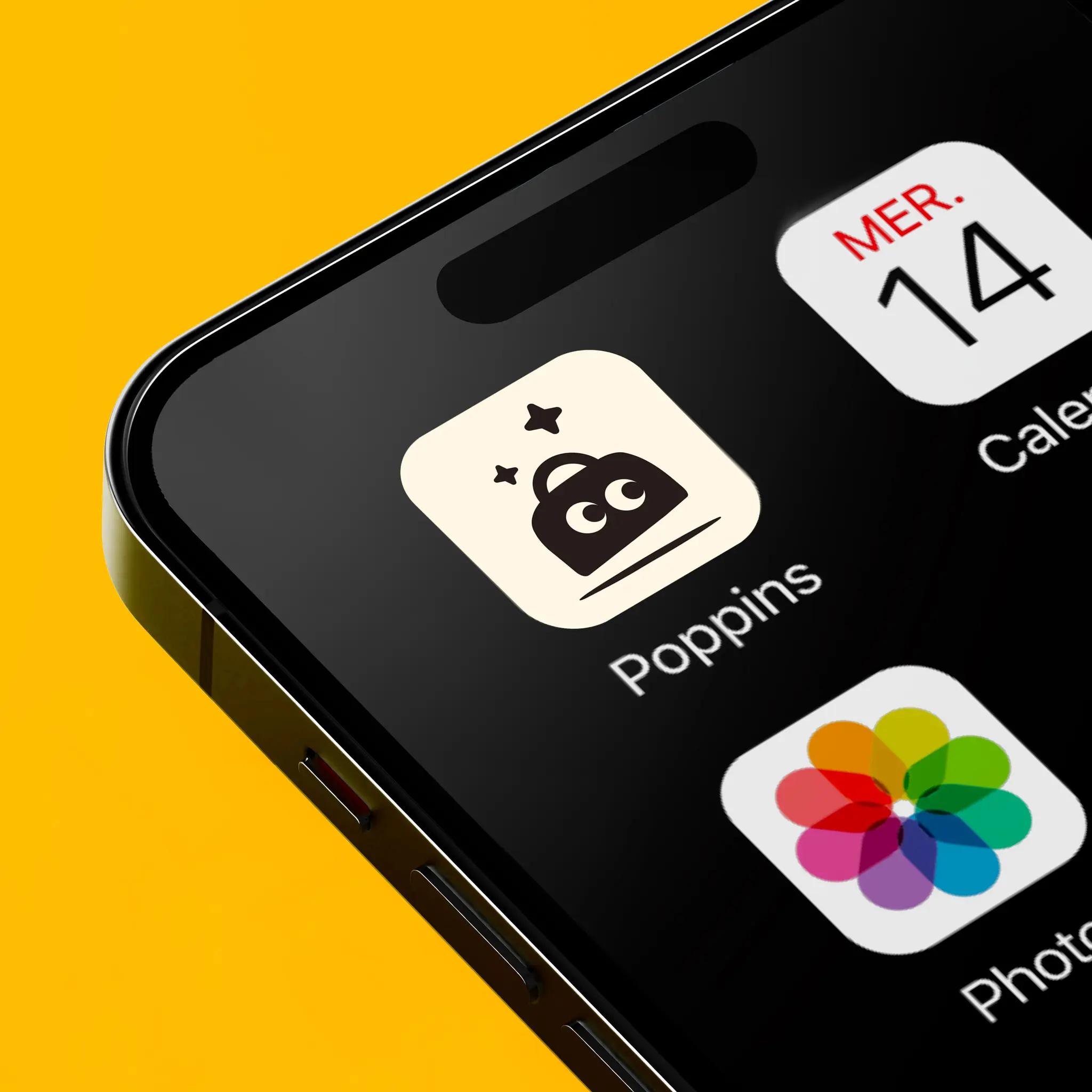
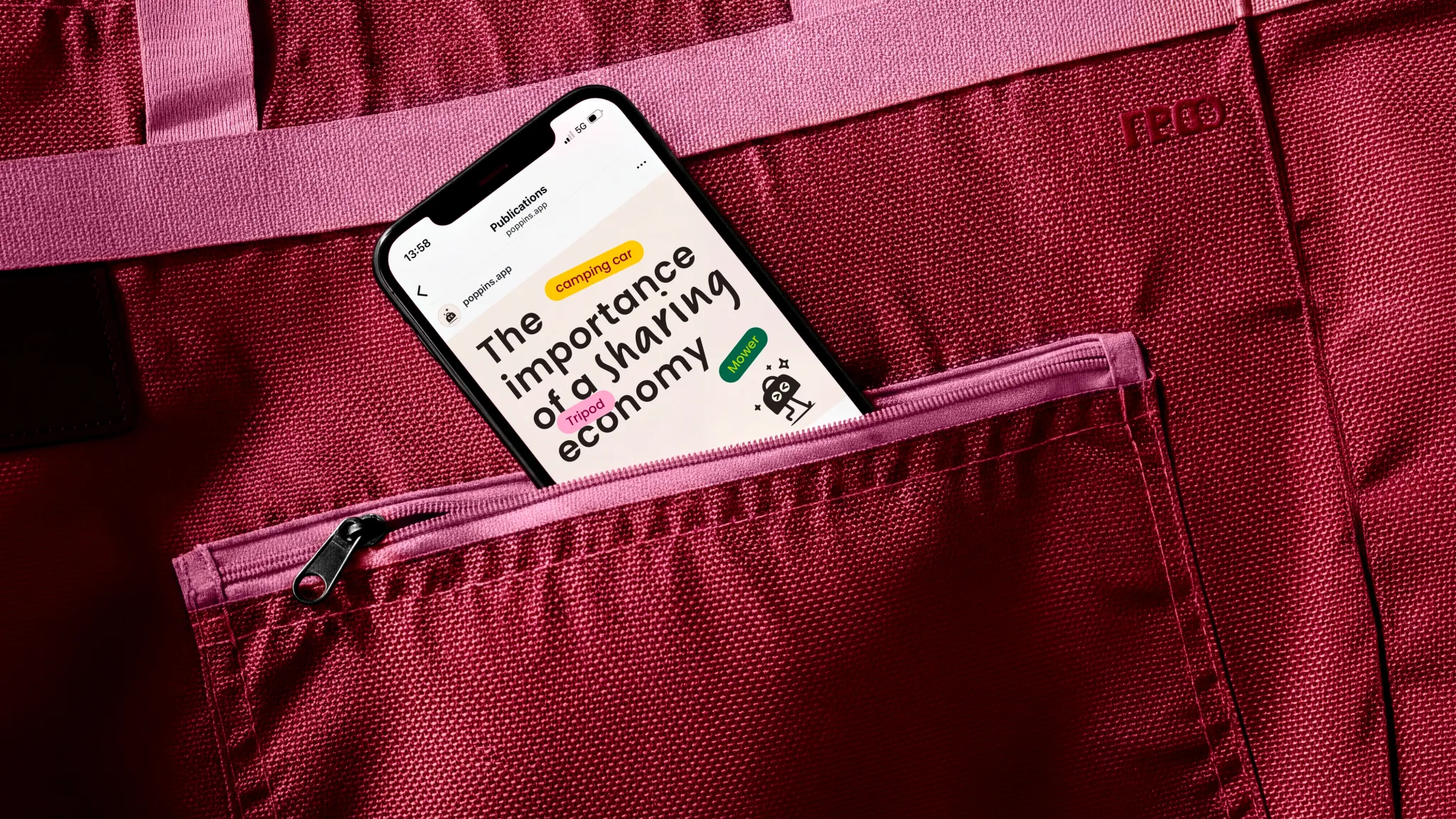
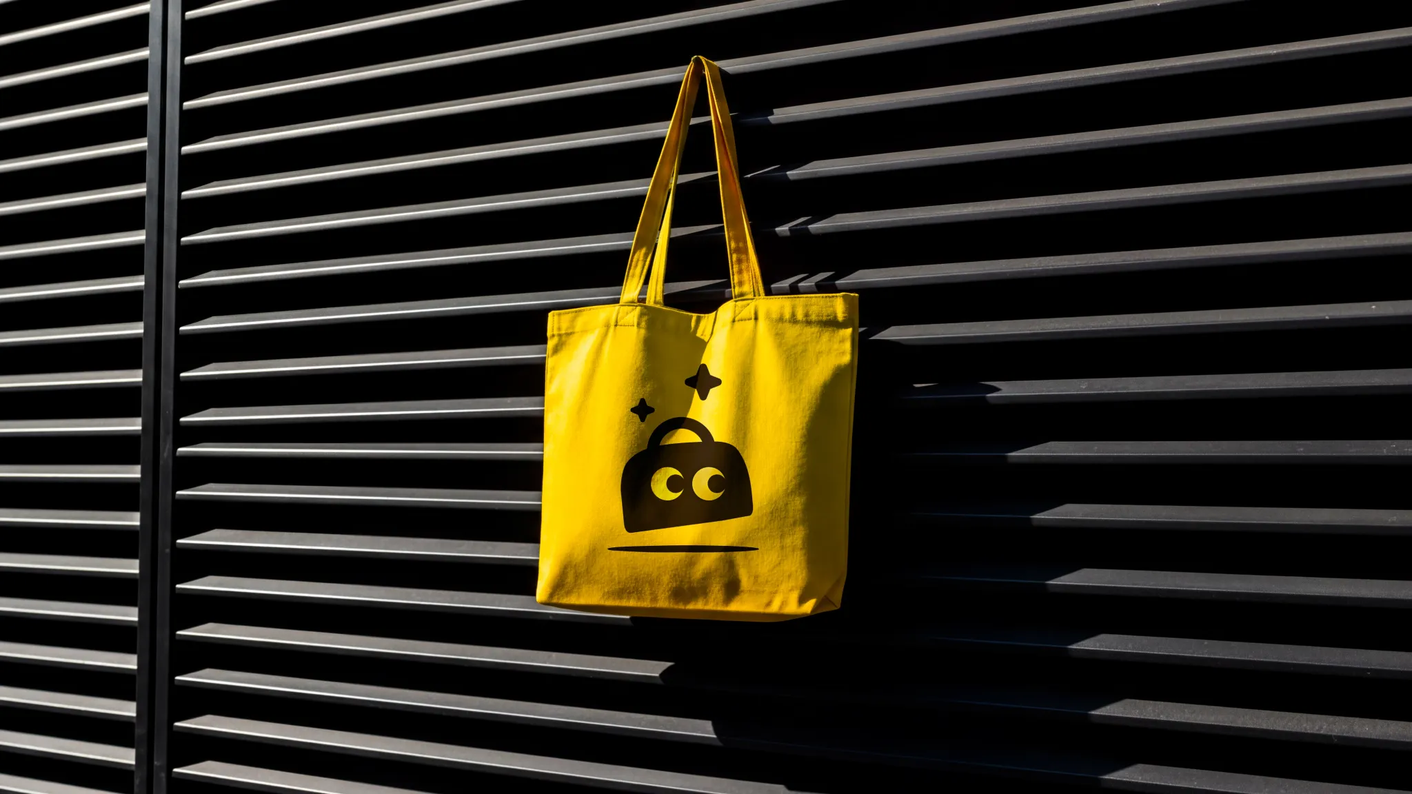
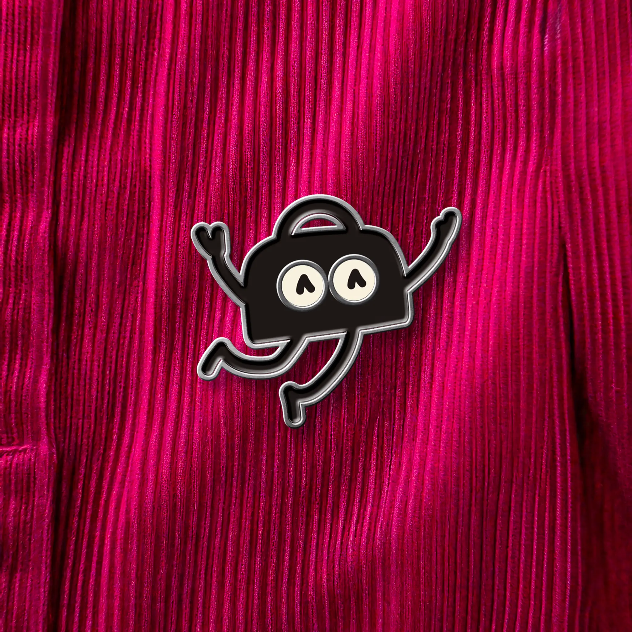
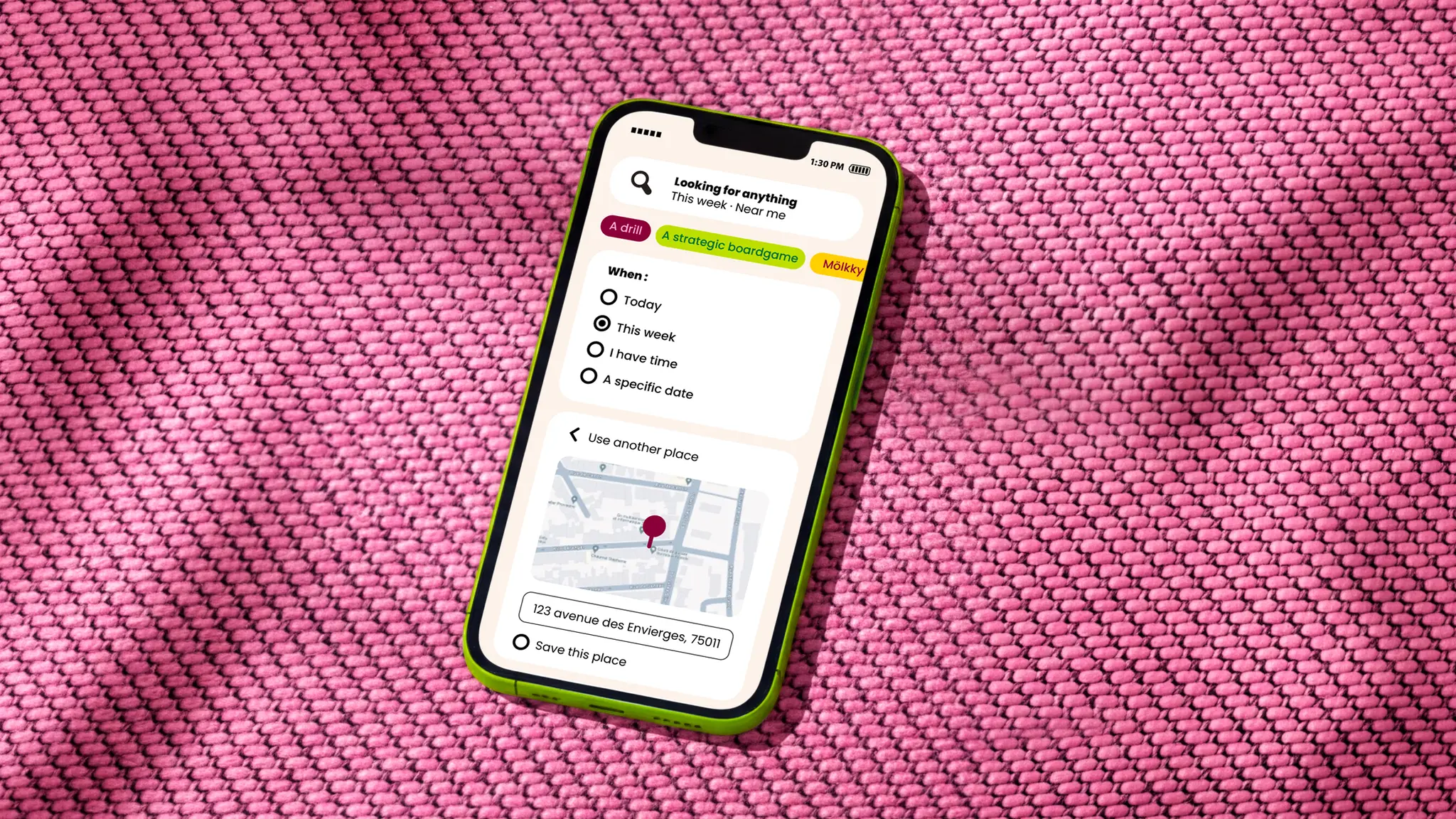
The name felt like an obvious choice. It evokes a familiar, resourceful and benevolent character, always ready to provide the right solution at the right moment — a direct metaphor for the service. We therefore created a joyful and reassuring brand, embodied by an expressive mascot that makes sharing feel tangible, human and desirable.
With this positioning, Poppins goes beyond being a simple service to become a new standard. A brand that makes sharing seamless and fun, helping people move from a logic of ownership to one of collective prosperity.
+250 000
Users reached rapidly