View.
Style and Impact
Iné
La redoute
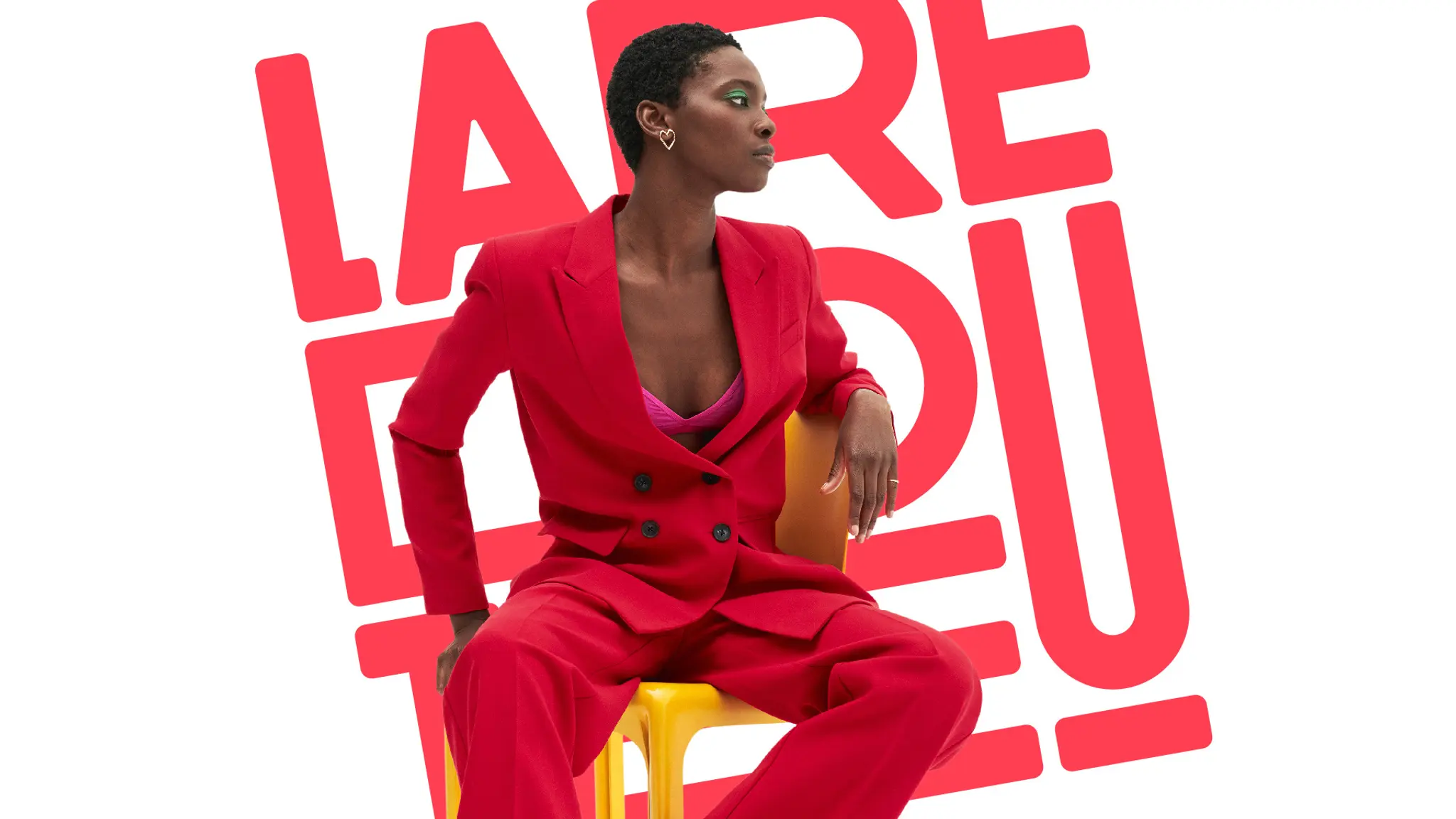
Brand Strategy / Communication Platform / Visual Identity / Design System / Logo Redesign / Global Rollout
As a long-established e-commerce player, La Redoute operates at the crossroads of several worlds — fashion, home and interior design. But in a landscape saturated with choice, this diversity can also create a risk of dilution. The challenge was to clarify its role and assert its distinctiveness: making everyday choices feel effortless and intuitive.
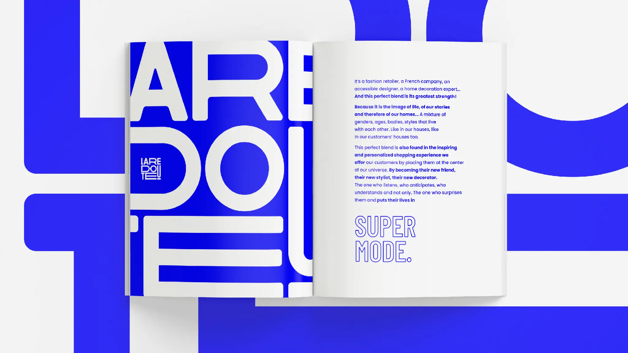
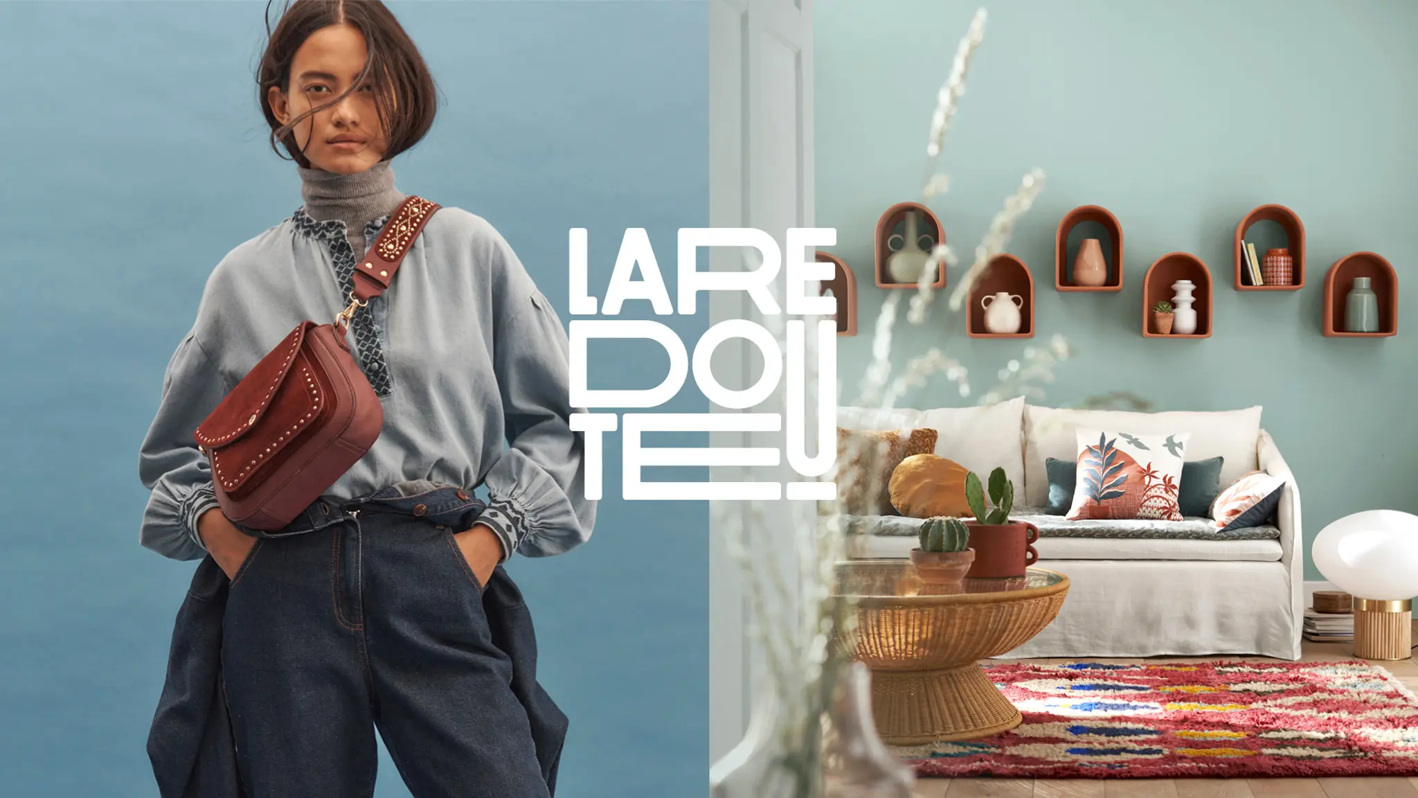
We built the brand around a founding idea: “The Perfect Blend,” turning the art of mixing and matching into a strength. A way of reimagining La Redoute as a place where styles, needs and desires come together, reflecting the reality of everyday life.
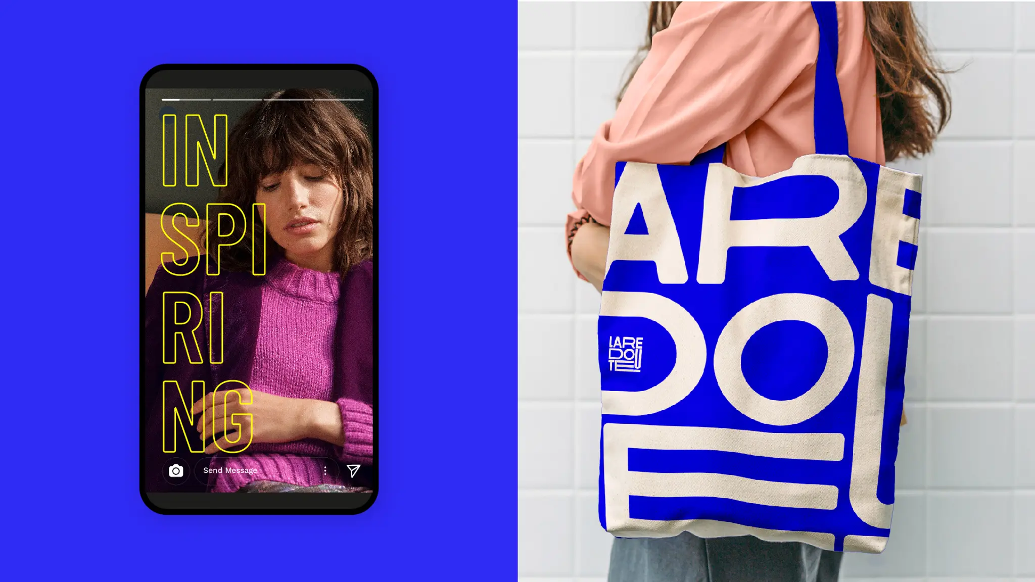
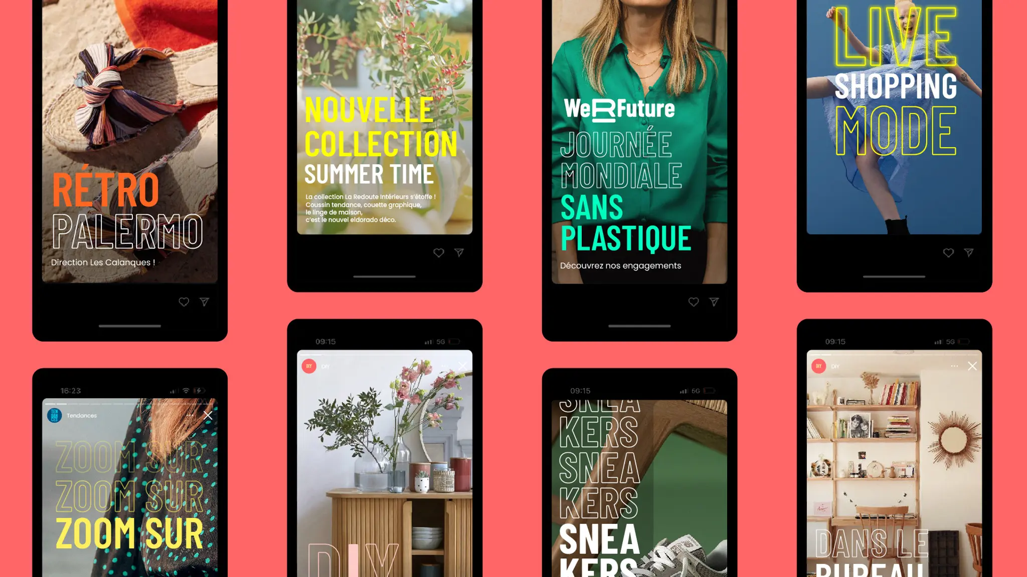
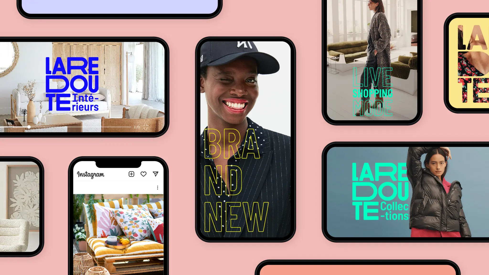
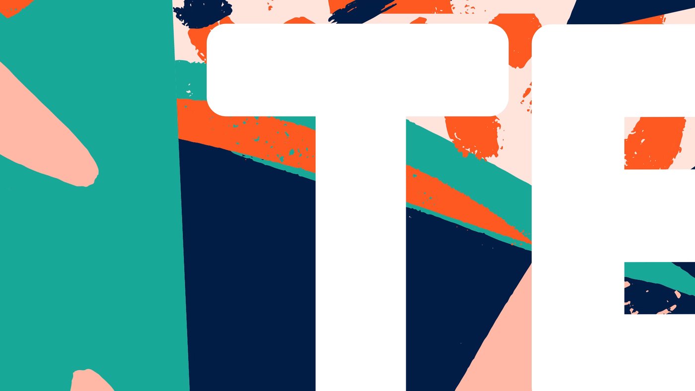
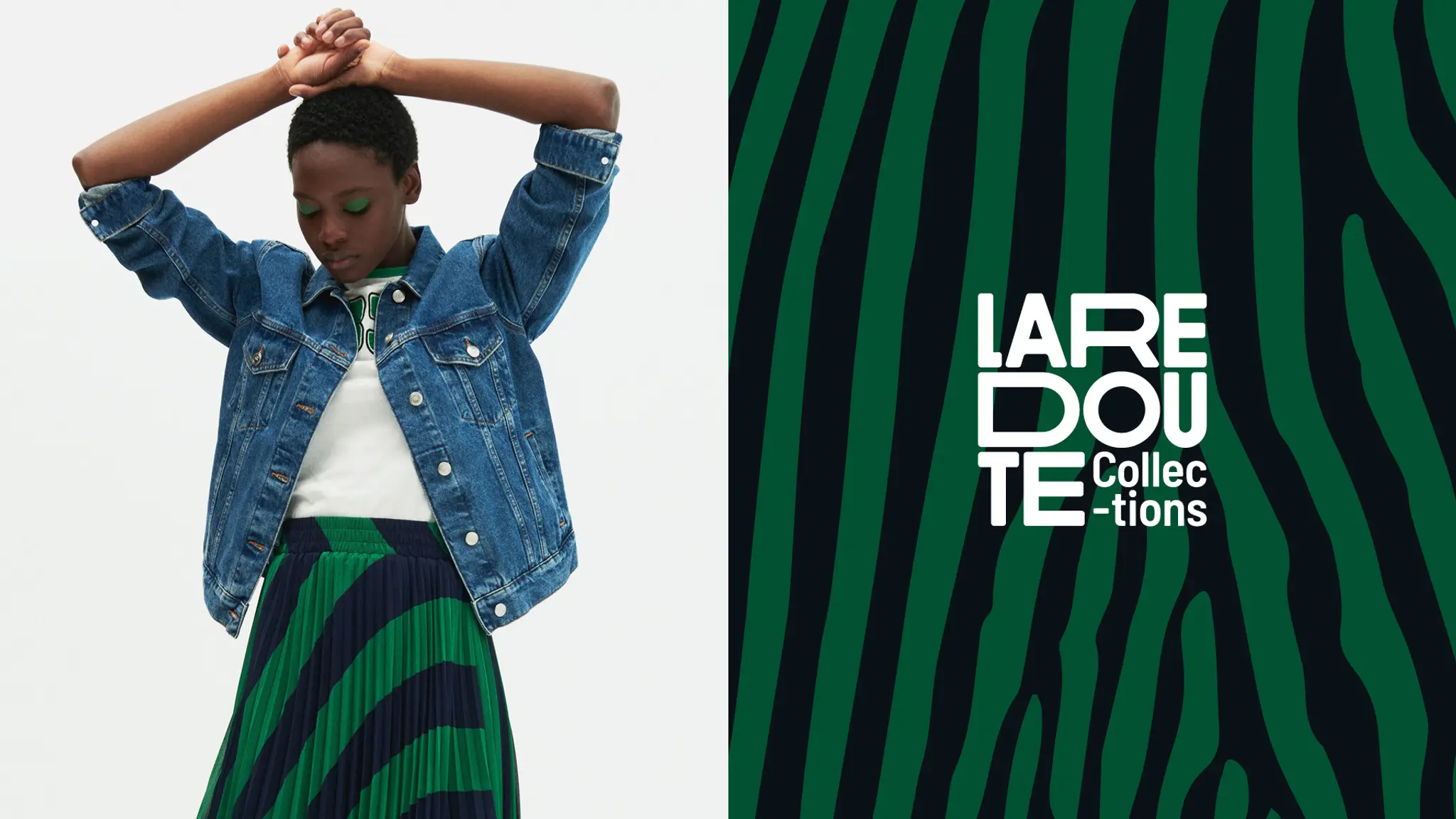

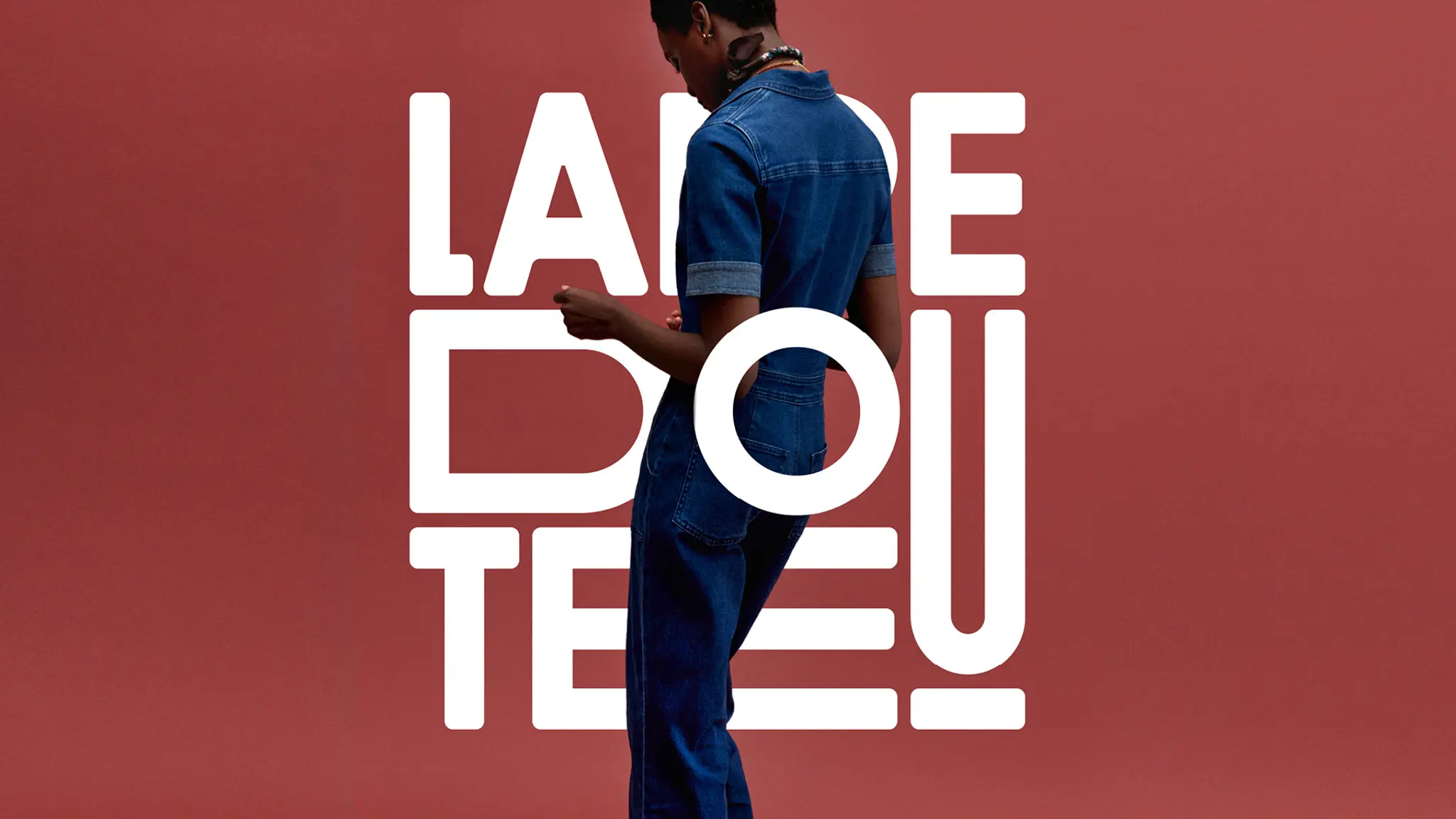
This vision takes shape through an identity designed as a living system. A modular window logo evokes the rooms of a home and the countless combinations they make possible, while a vibrant colour palette and a graphic language combining structure and softness express this carefully curated diversity. A brand capable of embracing every style while maintaining a strong sense of coherence.
With this brand shift, La Redoute moves from being a multi-category e-commerce retailer to becoming a curator of everyday life. A brand that no longer asks people to choose, but helps them create their own combinations.
78%
positive feedback on the logo, which was perceived as more modern